Pearson Pulse
Improving education in rural India and beyond
As the largest education company and book publisher in the world, Pearson know a thing or two about learning.
Their global Learning Management System (LMS - nicknamed Pulse) is aimed at teachers and learners aged 5-17 in schools around the world. With various in-market teams creating their own UX & UI for Pulse (using a white-labelled backend), Pearson faced the prospect of continual brand fragmentation and a lack of consistency. They had to introduce the company's new brand to these teams, and needed a singular platform on which they could launch it.
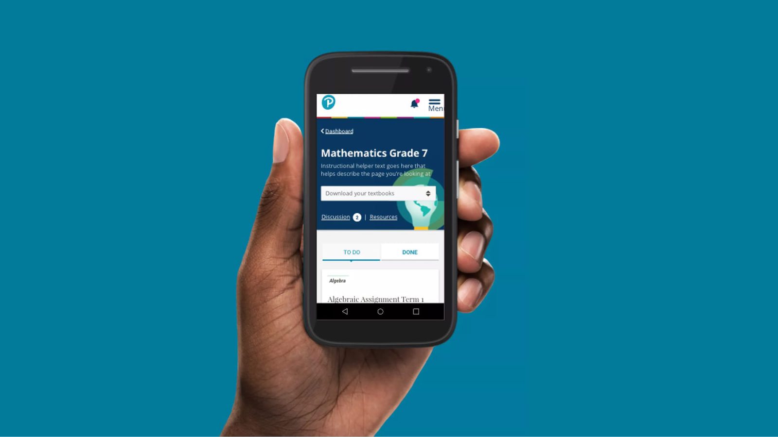
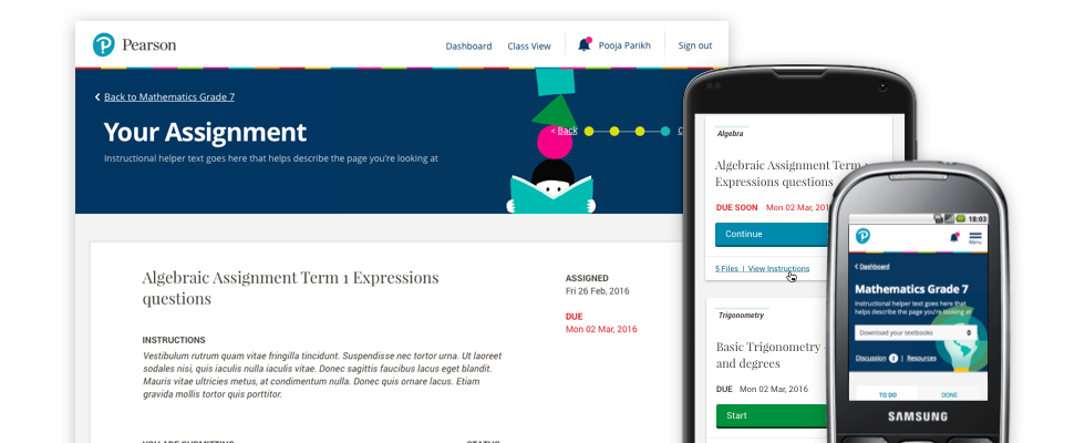
Pearson decided to create an Minimum Viable Product (MVP) of a newly-designed Pulse for two of their key markets: India and South Africa, followed by other markets later in the year. Those key markets had something in common: learners tended to use their own personal devices to access their education curriculum, and their connectivity was typically low. By comparison the teachers tended to create assignments on desktop computers in a classroom. Similar Learning Management Systems designed for audiences in Western Europe and North America deliver huge payloads to their users, assuming high-speed broadband and WiFi. This wasn't an option as far as Pearson were concerned. We had our work cut out for us.
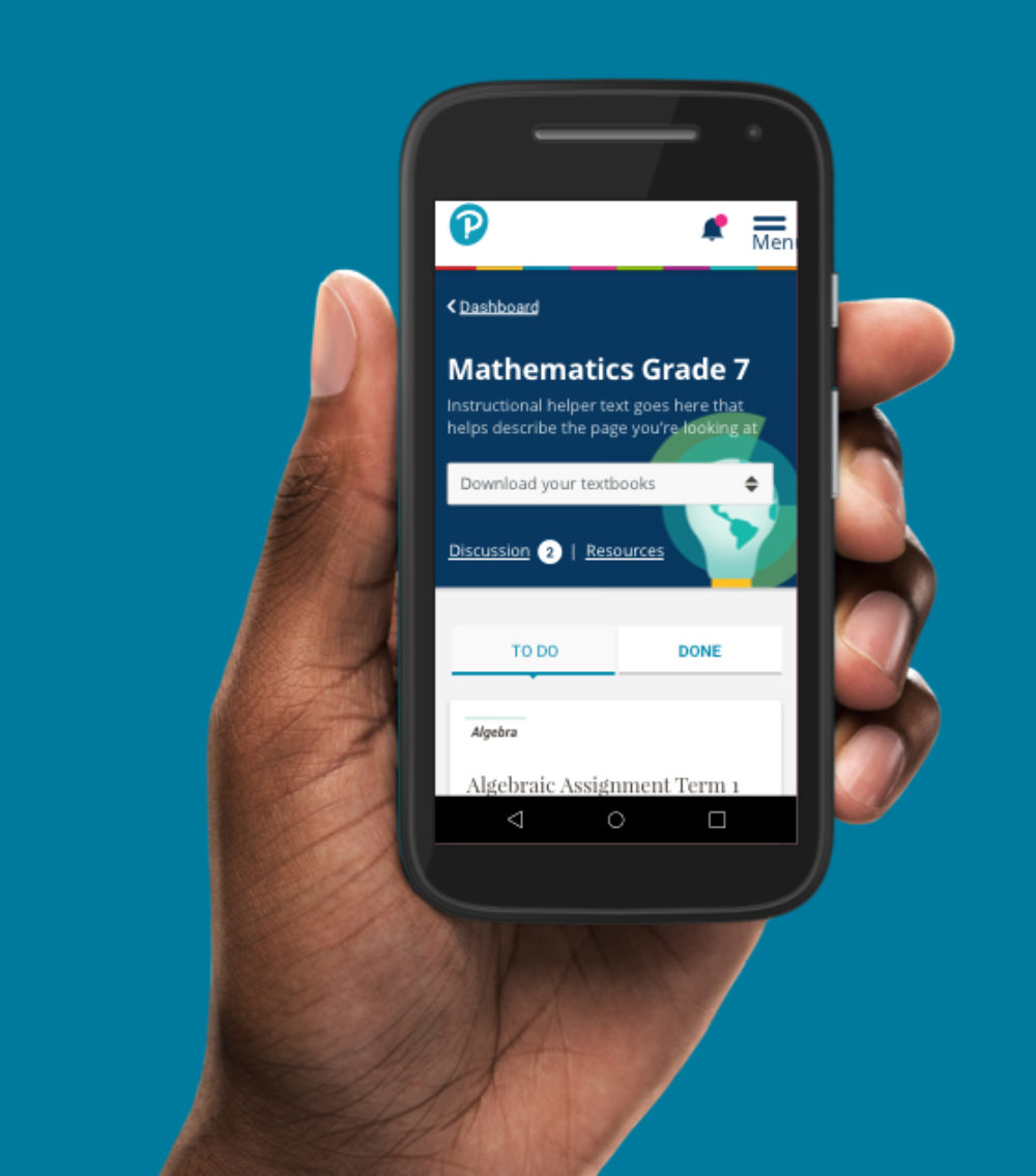
We were up at Pearson's head office for a sprint playback. I knew that the learners we were designing for were on older Android devices, averaging 2G speeds or less. It dawned on me that my designs still weren't lightweight enough to meet our aggressive page budget. The design had to be refactored for as low a page size as possible. But how?
Jon Aizlewood, Senior Visual Designer, Project Lead
The Results
One Platform.
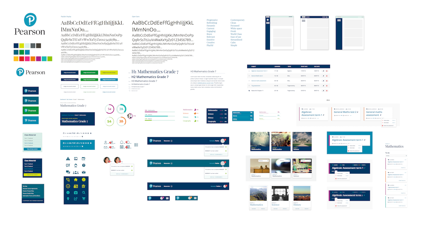
Our deliverables - a front-end component library paired with a comprehensive design manual - gave Pearson's in-market learners and teachers a consistent, cohesive brand experience of Pearson's product. With the UX & Design incorporating feedback and business requirements from the various in-market teams, the new platform will replace various older versions, reducing costs and improving efficiency.
Performance as a persona.
The proto-personas we created for Pulse resonated across the organisation. We saw them being shared amongst project teams outside of Pulse, championing the notion of designing for users with low connectivity. Moreover, our page budget remained intact throughout the project, ensuring learners received only what they needed to learn and nothing more.
Agile delivery.
Pearson's off-shore development team weren't accustomed to working 'agile', nor to working with component libraries. Agile rituals like stand-ups, sprints, demos & playbacks, meant they could flag any issues or blockers that arose. Code reviews identified issues or bugs before implementation, and the accompanying design manual meant they could design and develop new features while keeping the visual language intact.
The Full Story
How do you design a web product that's better than its incumbent versions?
We started by getting under the skin of Pearson's learners. When do they use the platform? How do they access it? How did their usage differ from that of their teachers?
Understanding the lack of connectivity for learners in India and South Africa was a breakthrough for us. We created a set of proto-personas as guides to understanding when and how both learners and their teachers used the product. The outcomes put the focus on performance.
Secondly, we spoke to the teams in-market and understood what needs they were addressing with their current, bespoke versions. These teams had the benefit of being in the same market as their users, which helped us understand and deliver a singular platform that addressed their needs as well as those of their users.
How do you design a super-fast web product?
We worked with Pearson to create a page budget, which quickly became the mainstay of our design and development process.
Websites are created with a mixture of HTML, CSS and Javascript, sprinkled with stylistic features like imagery, video and web fonts to enhance the experience. These elements also affect the page's weight. The more elements used, the longer it takes for users to download the page when connected. A page budget puts a cap on the page's weight, and it forced me as the designer to question everything on the page. Flourishes and nice-to-haves had to earn their place.
Our lowest, most aggressive page budget target was 107KB. Our top-end range was 210KB. We calculated this using http://www.performancebudget.i... and aimed for a load time of 5 seconds over an average 2G connection.
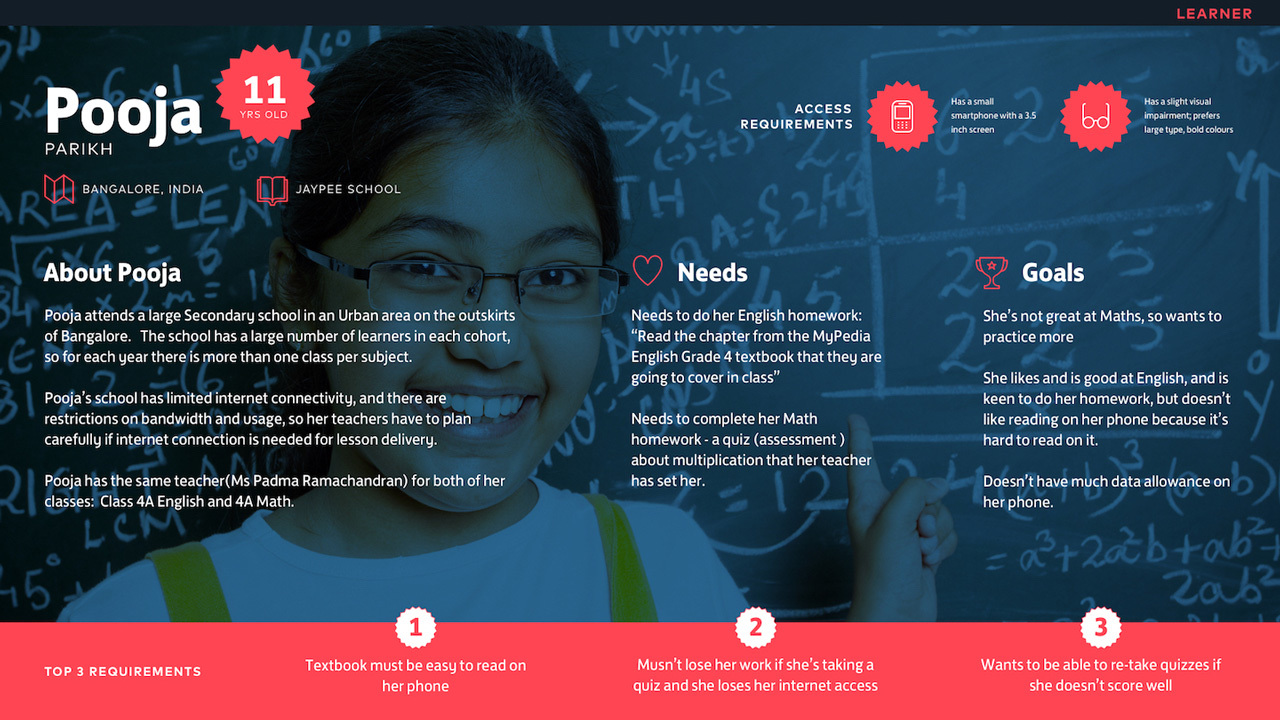
"It was really interesting designing for kids. The majority of learners were aged between 9-12, which is an interesting intersection of design sensibilities. Interfaces for this age group can't be too childish, but some early work still felt a bit too 'grown-up'. As a result we added some illustrative assets from the brand to make it feel a bit more approachable. User testing proved that we hit the sweet spot."
Jon Aizlewood
How do you create a design language to be used by various teams and across multiple mobile platforms... with a brand new brand?
When we kicked off the project, Pearson's new brand wasn't yet public. The Pulse project would be the first foray into its digital application, and a lot of stakeholders across the organisation were showing a keen interest.
We explored various options using the new brand. At the start of the project, we allocated time towards brand exploration and UI iteration during each design sprint. And at the end of each sprint, we invited stakeholder feedback. This allowed us to evolve the design language throughout the project in order to accommodate new features or act on outcomes from user testing and feedback received.
As the design language grew, we developed a component library and design manual for handover and maintenance. These deliverables allowed Pearson to continually iterate on our initial work in order to provide the best possible experience for its users. Concurrently, the design language was ported over to both iOS and Android.
This case study was originally published on Clearleft's website.