Digests: Icebergs & innings
In my binging of recent podcast episodes there was another from the Design Better show that caught my eye 👁 / ear 👂.
In the show with Scott Berkun I was reminded of the difference between fictional, speculative design versus real design. In the episode Berkun discusses a ‘recent’ occasion (in fact it wasn’t recently, which makes me think the episode was recorded a while ago) where a designer became well-known overnight for redesigning a flight boarding pass.
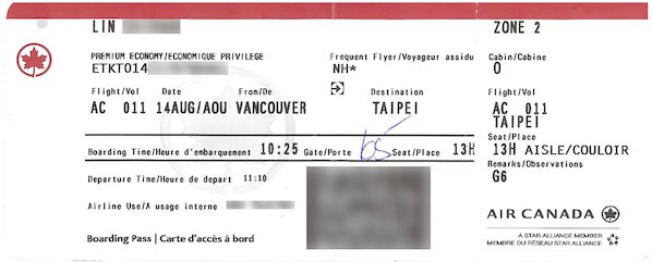
At the time the redesign hit a collective nerve. Many people sympathised with the pain and frustration of our beloved flight boarding passes. Their unwieldy shape and size, terrible typography, contrast and layout were the types of things many designers fantasised at changing.
The reality is, the aesthetic and visible problem is the easy part. To quote Berkun:
“Literally 100,000 designers could redesign the pass to look better.”
To use an overused cliche, this is an iceberg of a design problem. 10% of the problem is immediately visible. It’s an aesthetic thing; a lick of typography, layout, hierarchy and common sense can easily sort it out.
The problem lies in the invisible 90%. Beneath the service there are so many constraints that (today) prevent the ideal boarding pass from being made. Outdated infrastructure and complex logistics mean that making a boarding pass with new dimensions, ultra-modern layout and typography are a utopia rather than a present-day reality.
Berkun points to the likely culprit: printers. They were all introduced in the 70s and 80s. Dot matrix, thermal sensitive paper and perforation requirements means the boarding pass can’t easily be changed from a single monospace typeface to outlined vector icons overnight.
Of course this isn’t to detract from the aforementioned designer’s intent to highlight and expose the problem. But by no means is it solved. If anything the exercise highlighted just how deep design needs to go (the invisible 90%) in order to end with the visible 10%.
Spec work is no different
On a similar note, this is precisely why speculative pitch and proposal work is such a fallacy. Organisations expecting to be wowed by shiny, glossy visuals are literally admitting they care only for the 10% of the problem; to be wowed by how the solution might look, not how it should function .
Equally the agencies undertaking the spec work are promoting the notion of solving only skin-deep problems rather than tackling the far-deeper processes, logistics, infrastructure etc that should result in real change. The AIGA has a great resource on the pitfalls of spec work.
Innings
As for innings, I turned a year older this week. My wife and I have known each since we were 13, are the same age, and amazingly have our birthdays 2 days apart. It makes for easier planning and celebrating, that’s for sure. We celebrated by taking the girls to a very fancy restaurant in town, where they ordered ‘mocktails’ and we ate like kings and queens.
Of course birthdays always trigger reflection. Both on the year just past, as well as where you’re at in life. Moving into 2022 feels odd (it should still be 2020!) but there’s lots of big changes on the horizon, and I’m excited.
As for age, it’s telling that more than a couple cards I got had these on the cover. 
November 20th, 2021